This guide will walk you through the basic fundamentals of Roblox UI design.
If you're a beginner and have no idea how to start designing UIs, this guide is for you.
By the end of this guide, hopefully you'll have a stronger grasp of the basics which will serve as a foundation for more complex projects in the future.
Be sure to subscribe to our newsletter and stay tuned for more tutorials and value just like this.
Canvas Setup
It's important to have a consistent and setup for our interfaces, as this will allow for an organized workflow and structure, which is essential to development that is taken to scale.
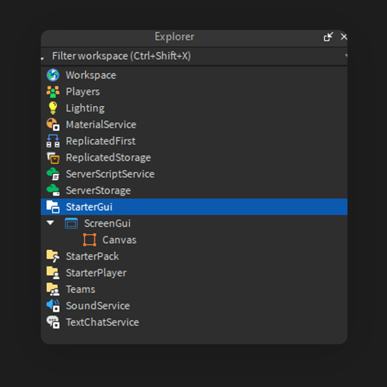
We'll begin by adding a "ScreenGui" into StarterGui, and then a "Frame" inside of ScreenGui.
We'll rename this frame "Canvas". The purpose of this Canvas frame is to give us control over all of the subsequent and following frames we create, which will be consisted within, or a child of this parent "Canvas" frame.
Adjust the properties of the Canvas frame
Set the AnchorPoint to (0.5, 0.5), which means 0.5 for both the X and Y values.
Set the Position in Scale, to X: 0.5, and Y: 0.5, which should look like this: {0.5 ,0} , {0.5, 0}
This will give us a centered frame.
Now, set the Size in Scale to {1, 0} , {1, 0}, which should cover our entire screen.
Make sure the Offset values for Size are 0.
Lastly, we'll change the BackgroundTransparency to 1 so that it is completely hidden.
Of course if you'd like to actually use a background, you can simply adjust its color, but usually, we can have this be fully transparent, simply to act as a canvas.
Pro Tip: Keep your naming conventions for your objects consistent.
This is it for our canvas—it should always contain our following UI, regardless of what it may be.
Basic Frame Properties
Now, we'll go over some basic properties and give you an overview of how these work.
Create a new " Frame " inside of Canvas.
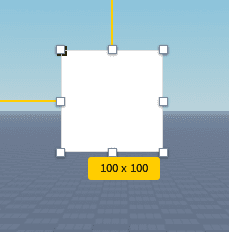
By default, with the AnchorPoint at [0, 0], you can see the slight shadow on the top left which indicates the position of our Anchor Point.
This means the AnchorPoint of our frame by default is at the Top Left corner.
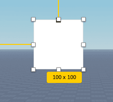
Though you are able to really add any value from 0 to 1, it is the best practice to use 0.5 increments.
Take a look at what happens if we increase our X value to 0.5. The Anchor Point has moved a step, and lands right in the center along the X axis. As a result now, our AnchorPoint is at the top center.
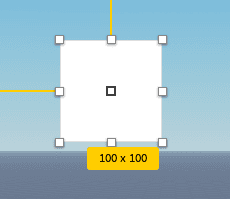
And if we adjust the Y value of our AnchorPoint, as expected, it now moves a step down vertically, giving us a perfectly centered AnchorPoint.
Why is this important?
Let's take a look at what happens if we change our Position to X: {0.5, 0} , Y: {1, 0}.
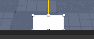
Our frame is at the bottom of the screen, but it appears that half of the frame has been clipped, or cropped off.
The reason for this is because of our AnchorPoint.
You can see that our AnchorPoint at {0.5, 0.5} runs centered with the bottom of our frame.
But we don't want that, we want the bottom of our frame to run flush with the edge of the screen.
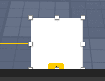
We can fix that by changing the Y value of our AnchorPoint to 1.
Now, as you can see, with our AnchorPoint at the bottom center, our frame now runs flush with the bottom edge of our canvas.
The same principle applies for the reverse direction, which would be at the top.
You can see how this is important.
If we were to construct a toolbar, or any sort of bar which is meant to run parallel to a certain direction, we would need the AnchorPoints to be congruent and adjusted accordingly.
Scale vs Offset
Understanding the difference between the Scale and Offset values are crucial to designing UI.
In short, Scale works with values from 0 to 1, that means we can do decimal values like 0.35, 0.5, or even 0.05. This is a percentage, which would be from 0 to 100%. 0.5 is 50%, and so forth,
When using scale, this means that the proportions would remain, even when the screen size is adjusted, or the aspect ratio of the screen has changed.
For Offset, it defines the absolute values. If we have X: 500px in Offset, it will remain 500px, regardless of what screen size you are using.
Generally, if we want our interfaces to be responsive, we are using Scale for a majority of the time; but there are certain, specific instances where Offset may be used.
This applies to everything which has both Scale and Offset as value inputs—whether it's UIPadding, UICorner, or otherwise.
To Scale a frame without any plugin, it's simple:
Just make sure the Offset values are 0, and you can add any Scale value, for example {0.1, 0} , {0.1, 0}, then, you can use the visual dragger to create your frame (it will also display its pixel values).
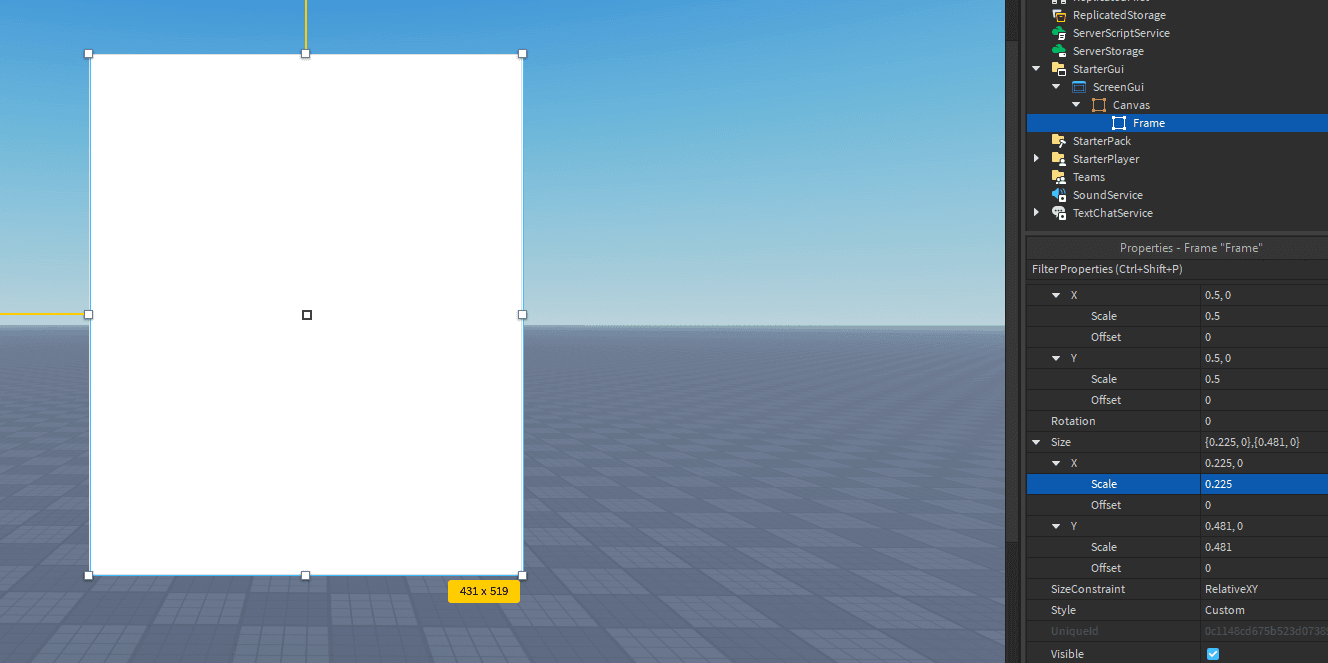
As you can see, our Frame is now working in the Scale value, but visually it will still display its pixel values, which is helpful if you need to mirror it with an existing design.
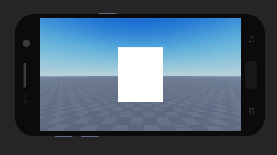
Now with any screen size, it will be responsive and resize itself accordingly, retaining its proportions.
That's it for this quick guide!
If you're interested in more advanced and complex interfaces, and to take your design to the next level, check out our premium tutorials inside our Design Academy by clicking here.
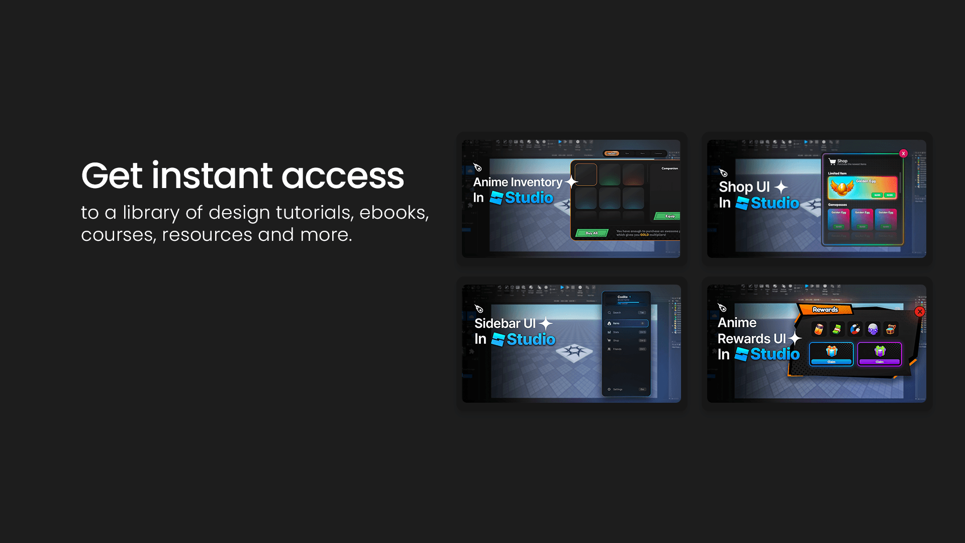
You'll get instant access to premium tutorials, resource files, and we also have material such as E-Books, Courses, and more to come in the future.
This guide is just the beginning, but the lessons provided here should give you a solid foundation as you progress on your journey in Roblox UI design.
When you're ready for the more intermediate and advanced stages, you can check out our YouTube videos, or join our Design Academy for exclusive premium tutorials and Roblox UI educational resources.
P.S. As a thank you for making it through this guide, here's an exclusive discount code: Use " LEARN " at checkout for 15% off design assets, bundles, premium tutorials and more.
Click here to visit our store and take advantage of this offer.


